A well-designed newspaper presents visually appealing content that is easy to scan and interesting to read. How do you build one? Start with the fundamentals.
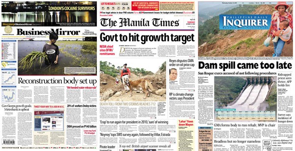
Among the throngs of broadsheets, tabloids and dailies in circulation over Metro Manila. These are my 3 well-designed newspapers (in order of choice). Business Mirror, The Manila Times, Philippine Daily Inquirer. These 3, by far, are best good examples in my opinion.
If you thought Manila Bulletin was included, yes it is, as our “Don’t Do This” example. :)
TED Talk: Jacek Utko
Jacek Utko’s speech at TED Talk is very inspiring not only because of his team’s success in redesigning Puls Biznesu and Estonia’s Äripäev (both Poland newspapers) but also because it made their newspapers relevant again. Even gaining more readers, amidst fierce competition from online publishing sources. They proved that good design can go a long way.
Design is just part of the success, and the process we made was not about changing the look. it was about improving the product completely.
Give power to designers
Utko took a lesson from his architectural education on function and form and translated it into newspaper content and design.
You can live in a small, poor country, like me. You can work for a small company, in a boring brand. You can have no budgets, no people – but still can put your work to the highest possible level. And everybody can do it. You just need inspiration, vision and determination. To be good is not enough.
That’s what’s so great about design. You don’t need any expensive equipment or plenty of man power to create a good design. No tangible investments or products to build. All you need is an inspiration and a medium to bring to life that great big idea.
Start with the fundamentals
 Grid Structure
Similar with designing websites. Grid structuring allows clean breaks and separation of content from each other. Grids are composed of rows and columns. It makes for a consistent look and allows readers to easily digest the information without being overwhelmed by the content presented.
“Well designed grid systems can make your designs not only more beautiful and legible, but more usable.” - Mark Boulton

Type Treatments
 Unique and bold typefaces complement the whole look of a newspaper. It makes the article interesting to read and not stressful. That’s why most newspaper use serif fonts on long texts because they’re easier on the eyes.
The positioning and placement of the text also adds to the overall structure of the article. Light text on a dark background (photo) is always eye-catching.
Philippine newspapers rarely do a light-on-black headline, except on special news days and holidays.

Usage of Imagery
 What would newspapers look like without photos and images? - Probably more like the yellow pages.
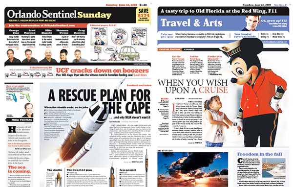
Photo cutouts and creative placement adds impact and interest to the article. A simple overlapping of photo elements can also add depth to an otherwise boring headline. Choosing and layouting a photo can make or break the look of your whole design.

Information Breakdown (Infographics, Graphs, Charts)
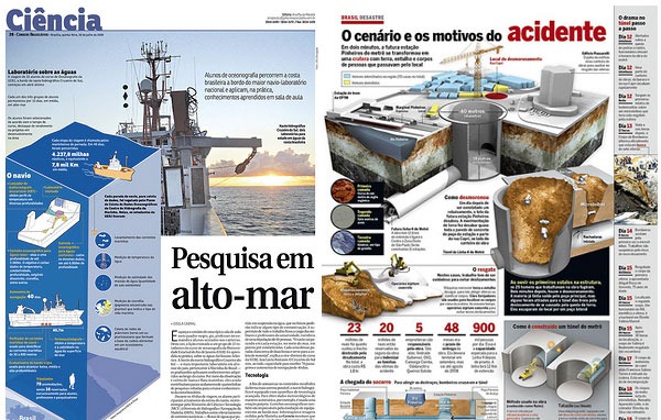
Most of us like to see pictures and drawings when we read. Infographics helps readers to easily understand the topic with the use of visual aids. It simplifies the subject by visually explaining the processes, statistics, hierarchy, functions, etc. described by cross section illustrations and charts.
We could use more of this on our newspapers. For example, the recent flood’s caused by Typhoon Ondoy can be explained by illustrating how the water spread quickly. Or, the possible cause and timeline of the recent Superferry mishap with accompanying statistics. Even simple topics like explaining how traffic builds up is interesting as well as informative.
---
More newspaper design @ News Design Flickr Pool


