Ryan Riegner, a 21-year old designer from Pennsylvania, came up with a unique redesign to the Philippine Peso bill. His design is a nice example of what our banknote bill can look like.
I’m not sure if it’s historically and culturally accurate but there are some inaccuracies in the specimen like the spelling of Republica instead of Republika and Isang Daang Libong Piso on a 100 peso bill. (Isang Daang Libong Piso translates to 1,000 100,000 pesos) He’s not from the country anyway so its understandable that he got some elements wrong, anyway, he still gets an A for effort.


See more printed specimens @ http://www.ryanriegner.com
“Paper currency, regardless of it’s technical beauty, elegant craftsmanship and saturation into everyday life, it is one of the most commonly overlooked aspects of remarkable design… so I chose to redesign some. I decided to go with the Philippine peso, as I will be traveling to Australia and Southeast Asia this winter. I chose to focus primarily on applying governmental requirements, specific imagery, color, and form relative to the Philippines that showcased both internal and external associations with this island nation, and I am more than pleased with the result. I plan to distribute them to locals, possibly as trade if and when I arrive.” - Ryan Riegner

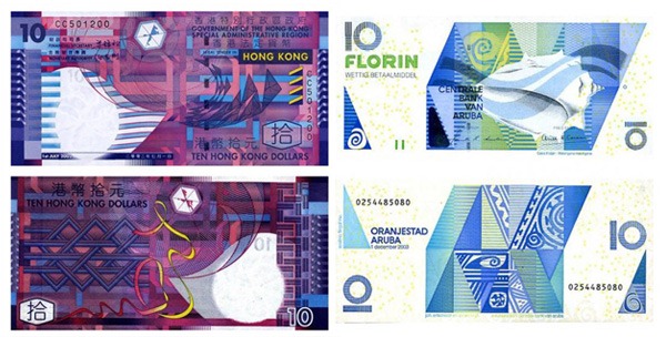
His design reminds me of well-designed banknotes from Hong Kong and Aruba.
Hong Kong uses polymer banknotes which are more durable and secure than standard paper banknotes. The design makes impressionistic references to modern architecture as well as to festive and cultural activities in Hong Kong. Aruba’s bills were redesigned by Evelino Fingal, an Aruban graphic artist and director of the Archaeological Museum, who found his inspiration for the eccentric designs in Native American tribal paintings, archeological pottery shards and native wildlife.
I wish the redesign the Philippine Peso comes sooner than later. It has looked the same way for decades now. Maybe the Bangko Sentral ng Pilipinas can hold a local design competition similar to the one done by the Swiss National Bank, participated by local talents and artists (using traditional and digital mediums). We can also ask the international design community to pitch their own proposals.
Money, especially bills, make their way into people’s hands and pockets everyday. All the time. It’s the only piece of artwork that is used by people everyday. Imagine the rich, the middle class, and the masa having access to a common piece of art. This can lead to more design/art appreciation and awareness for all! but that’s just wishful thinking for now.


